Thursday, December 22, 2011
Christmas Vacation
I'm taking a brief hiatus from blogging until the end of the year. This is my time to relax and visit with family. I hope you make time to do the same! Have a wonderful Christmas and I will see you in 2012.
Monday, December 19, 2011
Unique Holiday Centerpieces
My husband and I hosted Thanksgiving for his family for the first time this year. I loved it!! One of my favorite parts of the hosting process was setting the dinner table. Gorgeous pumpkins from a local farm adorned various parts of our house throughout October and November, so I gathered them at the base of a fun outdoor lantern stand. (The stand might look familiar since I used it for a July fundraiser event. For that tablescape, I incorporated fresh daisies, appropriate for the summer season.)

The benefit of this lantern stand is that it is tall enough for the lowest lantern to hang above eye level when guests are seated at the table. One element we often overlook when setting the table is the ability for our guests to converse freely. It is important to select a focal point for the table that is low enough to talk over or tall enough to see under. There is nothing worse than sitting down to enjoy a delicious meal and having to peer through the candelabra or flowers to chat with friends.
Here are a few creative ideas that can inspire you to make your own beautiful centerpiece for your Christmas table.
 A simple red cloth gathered underneath a grouping of silver candlesticks, hand-carved Santas and a vine of glittery berries makes a stunning centerpiece for a large table.
 Clustering pieces that vary in height adds dimension to a centerpiece. Don't be afraid to turn items on their sides to make things more interesting.


The benefit of this lantern stand is that it is tall enough for the lowest lantern to hang above eye level when guests are seated at the table. One element we often overlook when setting the table is the ability for our guests to converse freely. It is important to select a focal point for the table that is low enough to talk over or tall enough to see under. There is nothing worse than sitting down to enjoy a delicious meal and having to peer through the candelabra or flowers to chat with friends.
Here are a few creative ideas that can inspire you to make your own beautiful centerpiece for your Christmas table.


For those who prefer something more traditional, gathering a plaid fabric around a beautiful floral arrangement makes any table gorgeous.
Thursday, December 8, 2011
Spiffy Stockings
Some of my favorite Christmas memories include dumping out my stocking and finding chocolate covered coins, other candies and little trinkets come pouring out. Stocking have come a long way since the days of my childhood. Here are a few of my favorites available now:
Pier One Regal Stockings. This reminds me of William and Kate. These stockings have a British feel and a regal color about them.

 Ballard Designs Polka Dot/Leopard Print Stocking. A little bit of whimsy and style to adorn your mantle.

Happy stocking hanging!
Pier One Regal Stockings. This reminds me of William and Kate. These stockings have a British feel and a regal color about them.
Pier One Striped High Heel Stocking. For the funky at heart. This stocking is soooo playful!
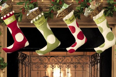
Happy stocking hanging!
Monday, December 5, 2011
Color Me Christmas
As with clothing and home fashion, colors come in and out of style for Christmas. My mother- in- law (very traditional by nature) has started to take notice of the changing color schemes for Christmas and is getting a little bolder. She is venturing away from her traditional deep red poinsettias and gold ribbon for her tree and experimenting with lime green mesh.
Lime green is still holding on as a favorite. You can pair it with the traditional Christmas red and emerald green to create a fun color story for you tree. Combining it with pink makes the decor very whimsical. Silver looks beautiful with this shade of green, as well. There is something about mixing an electric shade of green with a crisp metallic that feels very wintry yet chic.
Rose, white and gold. I refer to this grouping as Victorian because of the feeling it evokes when I see these colors together. They look very romantic and feminine when used together. Throwing in a little blue is a beautiful compliment, as well.
Turquoise and gold is a pairing inspired by the peacock. When feathers started creeping in to Christmas decor, the richness of turquoise began to take hold. Accenting with plum gives you a regal look. The gold serves as a little bling to keep your tree from getting too dark.
Black and silver make great accents to any color scheme. Ornaments or decorative stems in black add a backdrop for the bolder colors to stand out. Silver can do a variety of things. The color can bring a sense of winter when used with other metallics, blue, or citrus colors (like the lime green I mentioned). It can also be used as an accent to beautify more traditional shades- red, rose, or emerald green.
Another mix of colors that has remained popular are the bright jewel tones. I used electric blue, hot pink and purple on a black Christmas tree this year and it was gorgeous! Those colors jumped right off the tree!
Over the past few years I've found it interesting that there isn't just one "hot" color or color combination but several. This year is no exception! Be like my mother-in-law, lose your inhibitions about Christmas and go for a new color scheme.
Thursday, December 1, 2011
Christmas Trends
It's finally December so I can talk about one of my favorite things: Christmas!!! This time of year is so exciting with the shopping and the festive decorations. And I'm lucky enough to get to adorn many people's homes in Christmas decor. I've already completed two homes and have several left to do in the coming weeks. Every year I read the trade magazines and blogs, attend market and gather info to discover what new items will be popular and what unique ideas there are to make my client's decor even more stunning than last year. Now I'm excited to share them with you!
Traditional tree toppers are going by the wayside. Instead of topping a tree with an angel or a star, people are using decorative stems. Creating a cluster of stems at the top of the tree adds extra height and keeps the top from getting too narrow and boring. You can take a mixture of items and work them in together to create a visually stunning topper. The best part is you can't mess it up. You simply stick the stems down into the tree and twist some small branches around them to keep them in place. If the branches don't cooperate you can always buy green pipe cleaners, Ribbon intertwined with the stems is also pretty. Here's an example of a tree I did that incorporated a funky topper full of stems.
 Burlap is staying strong even now that Fall is over. I devoted an entire post to this fabulous textile a few months back. I've used burlap in wreathes and in ribbon form for a tree. Burlap pairs very well with shiny ribbon or ornaments to juxtapose two completely different textures.
Feathers are still a hot commodity like they have been in previous years. You have an assortment to choose from- peacock, pheasant, brightly colored feathers to suit any color scheme. You can bend and shape them so they are exactly how you want them. Feathers are fun to incorporate in wreathes, garland or your tree topper to make the item (tree, wreath or garland) appear fuller and larger.
You can't go wrong with incorporating food into the Christmas decorating. As long as it's the right kind of food. I'm not talking about mashed potatoes or turkey. Berries and apples have always been prevalent in holiday wreathes, garlands and centerpieces. They are especially appropriate in dining rooms and kitchens. This year artichokes are joining the ranks. The layered skin adds depth to decorations and the texture looks beautiful next to evergreen needles.

Come back Monday to read about the popular colors for this Christmas!
Traditional tree toppers are going by the wayside. Instead of topping a tree with an angel or a star, people are using decorative stems. Creating a cluster of stems at the top of the tree adds extra height and keeps the top from getting too narrow and boring. You can take a mixture of items and work them in together to create a visually stunning topper. The best part is you can't mess it up. You simply stick the stems down into the tree and twist some small branches around them to keep them in place. If the branches don't cooperate you can always buy green pipe cleaners, Ribbon intertwined with the stems is also pretty. Here's an example of a tree I did that incorporated a funky topper full of stems.

Feathers are still a hot commodity like they have been in previous years. You have an assortment to choose from- peacock, pheasant, brightly colored feathers to suit any color scheme. You can bend and shape them so they are exactly how you want them. Feathers are fun to incorporate in wreathes, garland or your tree topper to make the item (tree, wreath or garland) appear fuller and larger.
You can't go wrong with incorporating food into the Christmas decorating. As long as it's the right kind of food. I'm not talking about mashed potatoes or turkey. Berries and apples have always been prevalent in holiday wreathes, garlands and centerpieces. They are especially appropriate in dining rooms and kitchens. This year artichokes are joining the ranks. The layered skin adds depth to decorations and the texture looks beautiful next to evergreen needles.

Come back Monday to read about the popular colors for this Christmas!
Monday, November 28, 2011
Not your Grandma's Fireplace
This is the time of year I really miss not having a fireplace! Since I don’t have one, I start admiring other people’s and take note of how their surrounds look. My favorite fireplace surrounds tend to be the ones that aren’t plain Jane and ordinary.

This surround was painted by a local artist and friend of mine, Natalie Brockman. The intricate carving, metallic accents and creamy marble-look make this surround a piece of art!
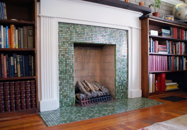
Simple and clean is what comes to mind when I see this fireplace. I love the miniature tiles running around the hearth and up the wall.

Another faux painting job done by yours truly. This surround had tile on the hearth and up the inside of the built-ins. However, the builder chose not to put any on the wall between the fireplace and mantle. It looked so awkward! My savvy client simply called me in to paint squares that mimicked her tile. Now you can’t tell the difference.
Thursday, November 17, 2011
Old School

Classrooms are leaving chalkboards behind and opting for dry erase boards and even smart boards. I, on the other hand have found a new appreciation for chalkboards! There are a slew of ideas that involve using chalkboard paint and creating a writing area on the wall to hold your grocery list or to let your children get creative. More recently, though, the idea of having a writing area on your drinking glass has popped up. You can buy glasses with a strip of chalkboard material on the side of the glass. For parties or large gatherings, this allows people to write their name on the glass to avoid mixing up drinks. For stemware, instead of placing the chalkboard on the side, the paint can be applied to the base of the glass. This allows the beauty of the drink or the glass itself to be seen.
As we move into the Christmas season, I am busy painting a variety of ornaments and glassware that people often buy as gifts. This year I am excited to add the chalkboard glasses to that offering. People are loving the concept and are ordering pairs to give to friends as hostess gifts.
Monday, November 14, 2011
Is it too Fall???
A large number of people, including myself are using warm earth tones in their home. I would venture to say that gold, in one shade or another, is replacing the taupe we saw throughout the early 2000s. The transition started with the Tuscan movement we had about 5 years ago. Everyone was in love with the plaster walls, wine inspired art and deep colors. Now some of the colors remain the same but the vibe is less Tuscan and more relaxed. People desire to make their home a warm, inviting place that they want to spend time in.
One client, who has these warm tones in her home, asked me if her home was too "Fall". I looked around a few moments and assured her that it was not. Yes, some of the colors mimicked those of the leaves on the trees outside, but she had a good mix of non- Fall colors to balance out the space. Shortly after this discussion I was reading Better Homes & Gardens magazine and ran across a blurb that addressed my client's concern. I couldn't agree more with what I read! If you have apace that is predominantly red, gold, orange or warm brown you can balance it out with accents of blues and greens. These colors are still very natural and earthy but they "cool" down the color scheme. Since blue is not a color you see on the foliage during Fall , it helps you avoid being "too Fall."
Thursday, November 10, 2011
The New Flower
I've been seeing gorgeous arrangements all over Pinterest and in magazines. I wouldn't call them floral arrangements because they don't contain many, if any , flowers. the focal point of the pieces are bare tree braches. No leaves on the branches, just beautiful, shapely arms stretching out from the trunk. It may sound barren, but look at these arrangements to see how you can blend the branches with other greenery to end up with a beautiful conversation piece!

A Fall ensemble that creates drama and interest for a mantle in a vaulted great room. The branch will provide the serious height we needed for a room with high ceilings.

A pair of these will create a winter wonderland in any room. It's the perfect balance of traditional (with the gilded greenery), trendy (tree branch) and dazzling (the metallic shades that play with the light). They will be used as part of Christmas decor in a formal room with a variety of gold silver and pink decorations.
All of the pieces shown above were custom created for my clients. I worked closely with my floral designer to find just the right pieces to compliment the decor of the homes we were working in. After the pieces were complete, my floral gal shared with me that before we made the arrangements, not too many people were interested in the tree branch. They didn't understand how to incorporate it into their decor. After our pieces were complete, the branches are selling like wildfire. We gave people some vision and they ran with it.
Monday, October 24, 2011
Brick House
I am partial to brick homes. I love the rich look the deep red colors bring to the exterior of a traditional house. I think the whitewashed brick shade gives a house a casual feel that is so inviting. If you had asked me a few years ago about painting brick, I would have said “don’t do it!”. However, I’ve changed my tune.
It is becoming a frequent occurrence for a home to not be entirely brick. In an effort to save money, many homeowners use brick on the front of the house but are placing siding along the sides and back. Others may use brick for the first floor and siding for the second floor. (NOTE- I am not referring to the well-designed Charleston style homes that tastefully use shakes and brick together.) Due to this mix & match trend, I think painting the brick is a great idea.
A home can look awkward to have tan siding and red brick paired together. An effective solution is to paint both the brick and the siding so the color of the house is unified. Using a continuous color makes the structure look larger, as well. One of my favorite shades for the exterior is Sherwin Williams’ Ruskin Room Green (0042). Coating a home with this color and placing tan, black or even red shutters on it is gorgeous! Another popular option is painting a house a warm tan (like Sherwin Williams Camelback 6122) and using black shutters. Paint allows for a major transformation in the look of a house at a significantly smaller price than making structural changes.
Thursday, October 20, 2011
A litlle bit of Monica in my life....
My husband jokingly (or so he says) calls me Lizzy Limits. I freaked out one time because we passed an Amish horse & buggy on a two lane road with a double yellow line. I emphatically explained that the double yellow line indicates it is dangerous to pass at that time. Through his tears of laughter, he assured me that we would be fine. He was right. But I still didn’t like breaking the rule.
Because of my Type- A tendencies, I have been compared to Monica Geller many times in my life. I like to follow the rules (illustrated by my previous story). I love to make lists and gather great satisfaction from checking items off of those lists. And I tend to be a little overzealous when it comes to tidiness in my home. I have sets of coasters strategically placed about our house. I like to preserve the beauty of the furniture we have and don’t want to find sticky Mountain Dew residue rings on the furniture. When we have a drink in the living room, the cup does not rest on the wood or glass top of a table, it settles on top of a stylish coaster. Coasters are inexpensive, but do a lot to protect the items in your home. Brightly colored coaster with family photos can make it exciting for kids. They will want to use the coaster and it will create a good habit in them. If you want to support your favorite sports team, get logo-ed coasters. Stores offer fancy marble ones or inexpensive rubber ones. For all the other Monicas out there- you can even find coasters for the drink holders in your car (I have some!). There is a coaster for every style, and price range.
Tuesday, October 18, 2011
Leaf Plans
Growing up we had two giant oak trees in our yard- one in the front of the house and one directly behind. We never had a shortage of leaves to rake. My friends and I liked to get creative and see what formations we could make. One day we came up with the idea of creating a floor plan out of the fallen leaves. We mimicked the concept of a bird’s eye view builder plan and used the whole yard to create our massive house. We were very thorough leaving openings to act as doorways (you can’t just walk through walls, of course). For authenticity, I spray-painted the image of a front door on the trunk of the oak tree in the backyard. At the time, I didn’t know that spray paint wouldn’t wash off the next time it rained. We spent hours in the yard after school changing the color of our bathroom, choosing where the sofa sat in the living room and lying on our beds made from leaves reading our favorite books. Our imaginations ran wild.
My love for creating beautiful homes, runs deep. Memories like this one are why I love Fall so much. It is the season that seemed to influence me more than any other when it comes to designing.
Happy Fall!
Thursday, October 13, 2011
Bonkers for Burlap
Hitting the scene hot and heavy has been burlap. Everywhere I look, I see burlap throw pillows, tableclothes, bulletin boards and signs. If you flip open a Ballard Designs catalog there are pages devoted to products made from this fine fabric. If you search for burlap items on Pinterest, a world of photos show up. I have always loved the visual texture provided by this natural fiber. It brings such rustic beauty to a dinner table when placed with fine china. You can shred it into pieces and tie it off to make a welcoming wreath for your front door. People are getting very creative with their application and I couldn't be more excited!

One of my favorite items I have found is burlap ribbon. It is available in an assortment of colors and widths perfect for a Fall wreath or your Christmas tree. The beauty of burlap is that it can be used for indoor or outdoor decoration. One friend is using shiny gold mesh and turquoise burlap in her tree to create not only a gorgeous color palette, but an interesting mix of textures and finishes. I encourage you to be creative when experimenting with burlap. You never know what you might come up with!
Monday, October 10, 2011
Southern-ize It!
On a call with a new client the other day she said to me, “All my friends have these beautiful Southern homes. I just don’t know how to do that. Can you help me?” I knew exactly what she was referring to- a sense of warmth and beauty that overtakes you as soon as you walk in the door. It’s hard to put your finger on and everyone views it a little differently. What does having a Southern home mean to you??
When I think Southern, I think about the symbol of the pineapple, delicious smells of homemade meals wafting out of the kitchen, and furniture pieces with a story. I also think of Southern hospitality and how a home should support that. A Southern home should feel complete but not overdone. Be beautiful but not stuffy. It should envelope you while within its walls, but not suffocate you. A Southern home should be just like a Southern woman- perfectly put together while making it look effortless.
So that is the mission I am charged with for my client: Southern-izing her home. We are beginning to tackle the house room by room until we have that effortless, inviting space she wants to show off to her friends.
Does your home evoke your idea of Southern? If so, cheers to you! If not, happy Southern-izing!
Thursday, October 6, 2011
Best Dressed
I love all things fashion. In college I studied Merchandising, Apparel & Textiles which offered an emphasis on fashion while still being very applicable to the interior design world I am in now. In my opinion dressing a room is very similar to dressing yourself. There are a few key pieces that you must have to be on point.
The Rug- A rug in a room is like good undergarments on a lady. That is your foundation for a good room. Your outfit would be ruined if you had on a super-cute dress but didn’t wear seamless undies. Or imagine how awful a shirt would look if (not to be too crass) your bra were too small. We are appalled by this, but everyday people buy rugs that are too small for their space. Don’t skimp on size!
Quality furniture- Trendy is fun, but it can be costly to keep up. If we only buy clothing that is the latest trend, we would be shopping and spending a lot. Our best bet is to find quality pieces that will stand the test of time that we can update with trendier accessories. The same is true with furniture. By selecting some classic upholstered pieces we set ourselves up to bring in trends through other elements in the room. This helps us to avoid being unhappy with our sofa when newer models come into the stores.
Glitz & Glam- Everyone has their preferred level of WOW! when it comes to accessories. With some people, you can’t put enough diamonds on them. With others, a simple pair of stud earrings and their wedding ring is all they choose to wear. I, myself, fall somewhere in the middle. I think accessories are where you can afford to play around with trends and get a little funky. Accessories in the home are not all that different from those we wear in fashion. We have pillows, window treatments, candlesticks, finials, etc to layer upon the furniture just like we have bracelets, necklaces, belts, scarves and leggings to create a layered outfit on ourselves.
Conversation pieces- I use my shoes as conversation pieces. When the sky is dark and dreary but I am wearing a black & gray ensemble, I throw in bright yellow shoes for cheer. I rarely select a plain shoe. I’m gazing into my closet now and don’t see one pair that doesn’t have an oversized buckle, a fun texture or sheen, or a bold color to it. The same should hold true for your art. Select pieces that catch your eye and lead you around the room. Think about what has meaning to you, what makes you feel comfortable and what might strike up conversation with your guests. Those are the pieces you want on your walls. Don’t feel like you have to put the same thing up all over. Not every pair of shoes you have goes with every outfit, and your artwork won’t naturally fit in every room. Mix it up with mirrors, painting, photos and framed prints.
Think about some of these things and how you’ve dressed your house. Does it really reflect you?
Subscribe to:
Posts (Atom)