Monday, November 28, 2011

Not your Grandma's Fireplace

This is the time of year I really miss not having a fireplace!  Since I don’t have one, I start admiring other people’s and take note of how their surrounds look.  My favorite fireplace surrounds tend to be the ones that aren’t plain Jane and ordinary. 


This surround was painted by a local artist and friend of mine, Natalie Brockman.  The intricate carving, metallic accents and creamy marble-look make this surround a piece of art!


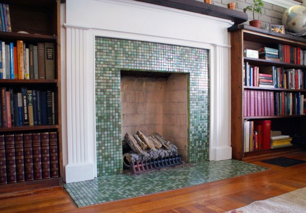
Simple and clean is what comes to mind when I see this fireplace.  I love the miniature tiles running around the hearth and up the wall.


Another faux painting job done by yours truly.  This surround had tile on the hearth and up the inside of the built-ins.  However, the builder chose not to put any on the wall between the fireplace and mantle.  It looked so awkward!  My savvy client simply called me in to paint squares that mimicked her tile.  Now you can’t tell the difference.

Thursday, November 17, 2011

Old School


Classrooms are leaving chalkboards behind and opting for dry erase boards and even smart boards. I, on the other hand have found a new appreciation for chalkboards! There are a slew of ideas that involve using chalkboard paint and creating a writing area on the wall to hold your grocery list or to let your children get creative.  More recently, though, the idea of having a writing area on your drinking glass has popped up. You can buy glasses with a strip of chalkboard material on the side of the glass. For parties or large gatherings, this allows people to write their name on the glass to avoid mixing up drinks.  For stemware, instead of placing the chalkboard on the side, the paint can be applied to the base of the glass. This allows the beauty of the drink or the glass itself to be seen.

 As we move into the Christmas season, I am busy painting a variety of ornaments and glassware that people often buy as gifts. This year I am excited to add the chalkboard glasses to that offering. People are loving the concept and are ordering pairs to give to friends as hostess gifts. 

Monday, November 14, 2011

Is it too Fall???

A large number of people, including myself are using warm earth tones in their home. I would venture to say that gold, in one shade or another, is replacing the taupe we saw throughout the early 2000s. The transition started with the Tuscan movement we had about 5 years ago. Everyone was in love with the plaster walls, wine inspired art and deep colors. Now some of the colors remain the same but the vibe is less Tuscan and more relaxed. People desire to make their home a warm, inviting place that they want to spend time in. 

One client, who has these warm tones in her home, asked me if her home was too "Fall". I looked around a few moments and assured her that it was not. Yes, some of the colors mimicked those of the leaves on the trees outside, but she had a good mix of non- Fall colors to balance out the space.  Shortly after this discussion I was reading Better Homes & Gardens magazine and ran across a blurb that addressed my client's concern.  I couldn't agree more with what I read! If you have apace that is predominantly red, gold, orange or warm brown you can balance it out with accents of blues and greens. These colors are still very natural and earthy but they "cool" down the color scheme. Since blue is not a color you see on the foliage during Fall , it helps you avoid being "too Fall."

Thursday, November 10, 2011

The New Flower


I've been seeing gorgeous arrangements all over Pinterest and in magazines.  I wouldn't call them floral arrangements because they don't contain many, if any , flowers. the focal point of the pieces are bare tree braches.  No leaves on the branches, just beautiful, shapely arms stretching out from the trunk. It may sound barren, but look at these arrangements to see how you can blend the branches with other greenery to end up with a beautiful conversation piece!

A Fall ensemble that creates drama and interest for a mantle in a vaulted great room.  The branch will provide the serious height we needed for a room with high ceilings.


A pair of these will create a winter wonderland in any room. It's the perfect balance of traditional (with the gilded greenery), trendy (tree branch) and dazzling (the metallic shades that play with the light). They will be used as part of Christmas decor in a formal room with a variety of gold silver and pink decorations.

All of the pieces shown above were custom created for my clients. I worked closely with my floral designer to find just the right pieces to compliment the decor of the homes we were working in. After the pieces were complete, my floral gal shared with me that before we made the arrangements, not too many people were interested in the tree branch. They didn't understand how to incorporate it into their decor. After our pieces were complete, the branches are selling like wildfire. We gave people some vision and they ran with it.